TextArea
- component fbx.ui.control.TextArea
TextArea is a multi-line text input with vertical scrolling capabilities.

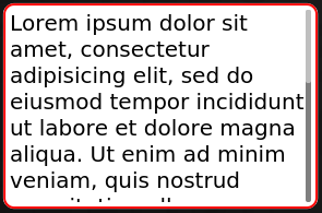
TextArea with focus, but not editing. Use will have to press OK (or Enter) to begin editing.
TextArea {
    placeholderText: "Enter a long text"
    height: 200
    text: "Lorem ipsum dolor sit amet, [...]"
    textFormat: TextEdit.RichText
}
- signal onLinkActivated(link)
- Parameters
link (
url) – Link to open
This signal is raised when user clicks on a link inside the widget. Links may be inserted as HTML markup, if relevant mode is enabled through
textFormat.
- property text
A string corresponding to the entered text. This property is updated upon validation of input value.

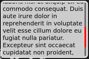
TextArea showing a text.
- property placeholderText
Text visible in the control when it has no text entered. This should be used as an invite message for user input.
- property font
Usual text font attributes.
- property readOnly
Whether the widget should accept text input or not. When the widget is read-only, it still accepts user interaction. This permits the user to vertically scroll the viewport.

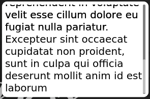
TextArea showing a read-only text. User can still scroll inside the viewport.
- property editing
Whether user is currently editing the widget. When widget is read-only, editing actually means having focus in the viewport, only used for scrolling.

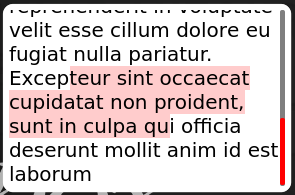
TextArea currently editing a wrappping text
- property enabled
Whether the widget accepts user interaction. If widget is not enabled, user may not scroll in its contents.
- property cursorPosition
Current cursor position in the input area.
- property cursorRectangle
Current cursor position in the input area, as a Qt.rect. Coordinates are relative to the flickable contents.
- property inputMethodHints
Hint for virtual keyboard presentation. Can take a value from:
Qt.ImhDigitsOnly
Qt.ImhUrlCharactersOnly
Qt.ImhEmailCharactersOnly
When using Qt.ImhDigitsOnly, virtual keyboard may not appear at all.
- property textFormat
The way the text property should be displayed.
TextEdit.AutoText
TextEdit.PlainText
TextEdit.RichText
