Scrollbar
- component fbx.ui.control.Scrollbar
Scrollbar shows current position in a 2d land.
Scrollbar element can be used smoothly with a
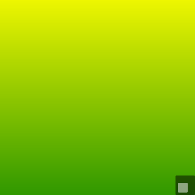
Flickable.¶Flickable { id: viewport contentX: 100 contentY: 300 contentWidth: 800 contentHeight: 800 Rectangle { width: 800 height: 800 gradient: Gradient { GradientStop { position: 0.0; color: "red" } GradientStop { position: 0.33; color: "yellow" } GradientStop { position: 1.0; color: "green" } } } anchors.fill: parent } Scrollbar { width: viewport.width / 10 height: viewport.height / 10 anchors.right: viewport.right anchors.bottom: viewport.bottom widthRatio: viewport.visibleArea.widthRatio heightRatio: viewport.visibleArea.heightRatio xPosition: viewport.visibleArea.xPosition yPosition: viewport.visibleArea.yPosition autoHide: true }
- property widthRatio
Ratio between currently viewable width and total width.
- property heightRatio
Ratio between currently viewable height and total height.
- property xPosition
Current position of the leftmost edge of viewport in the scrollable view. This must be between 0 and 1 - widthRatio.
- property yPosition
Current position of the uppermost edge of viewport in the scrollable view. This must be between 0 and 1 - heightRatio.
- property autoHide
Whether scrollbar automatically hides itself when viewport is at a stable position.
- property cursor.color
Color for the cursor rectangle
- property cursor.radius
Border radius for the cursor rectangle
- property color
Color for the background rectangle
- property radius
Border radius for the background rectangle