Combo
- component fbx.ui.control.Combo
A combo is a control where the user may choose one value withing a set of predefined values.

A Combo without active focus. Only the current choice is shown.
Combo {
    items: ListModel {
        ListElement { label: "HDMI"; value: "AudioOutportHdmi" }
        ListElement { label: "SPDIF"; value: "AudioOutportSpdif" }
        ListElement { label: "Analogique"; value: "AudioOutportAnalog" }
    }

    onSelected: console.log("Selected index", index, "value", value);
}
- signal selected(index, value)
- Parameters
Raised when user selects an entry in the Combo.
- property value
A variant corresponding to the currently selected entry in the list.
- property items
Reference to a ListModel of items containing “label” and “value” keys.
- property surroundingElementCount
Count of elements visible around currently selected item. This makes (2 * surroundingElementCount + 1) total items visible.
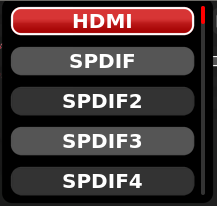
A Combo with active focus and
surroundingElementCount =
2
. Current choice is highlighted. When all possible choices are shown,editing = true.
- property editing
Whether user is currently editing the widget. This may change to false without the value actually changing, if user cancels its input.
- property enabled
Whether the widget accepts user interaction.
- property displayText
Text to display if the widget has to be replaced with a simple text.